


 Menu
Menu
 Back to All News
Colour Psychology
Colour psychology is sometimes dismissed by many, but did you know that it has a massive impact on our mood and wellbeing?
Choosing colours that positively enhances our moods can bring great rewards. A purposeful choice can make us feel happy, motivated, fill us with confidence, positive, calm us down and even help us concentrate better. It's important to get it right when decorating a home with so much hanging on our colour choices.
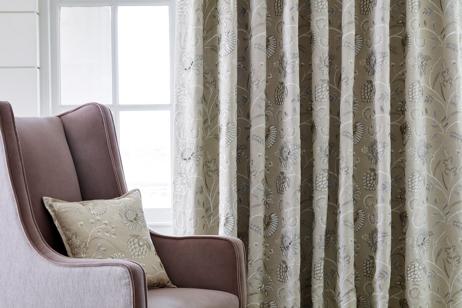
PINKS
Pink is a delicate shade in colour psychology that speaks of love, femininity and nature. It can be underestimated as a colour only to be used for little girls' rooms.
It's tones are comforting, making it a favourite for bedrooms. Still, it can easily be transferred to living room schemes if executed well, like the image above from our Fitzrovia collection.
Give the colour a chance in your adult life, even if it's just a little bit of pink, by opting for an accent piece of furniture or accessories in pink.
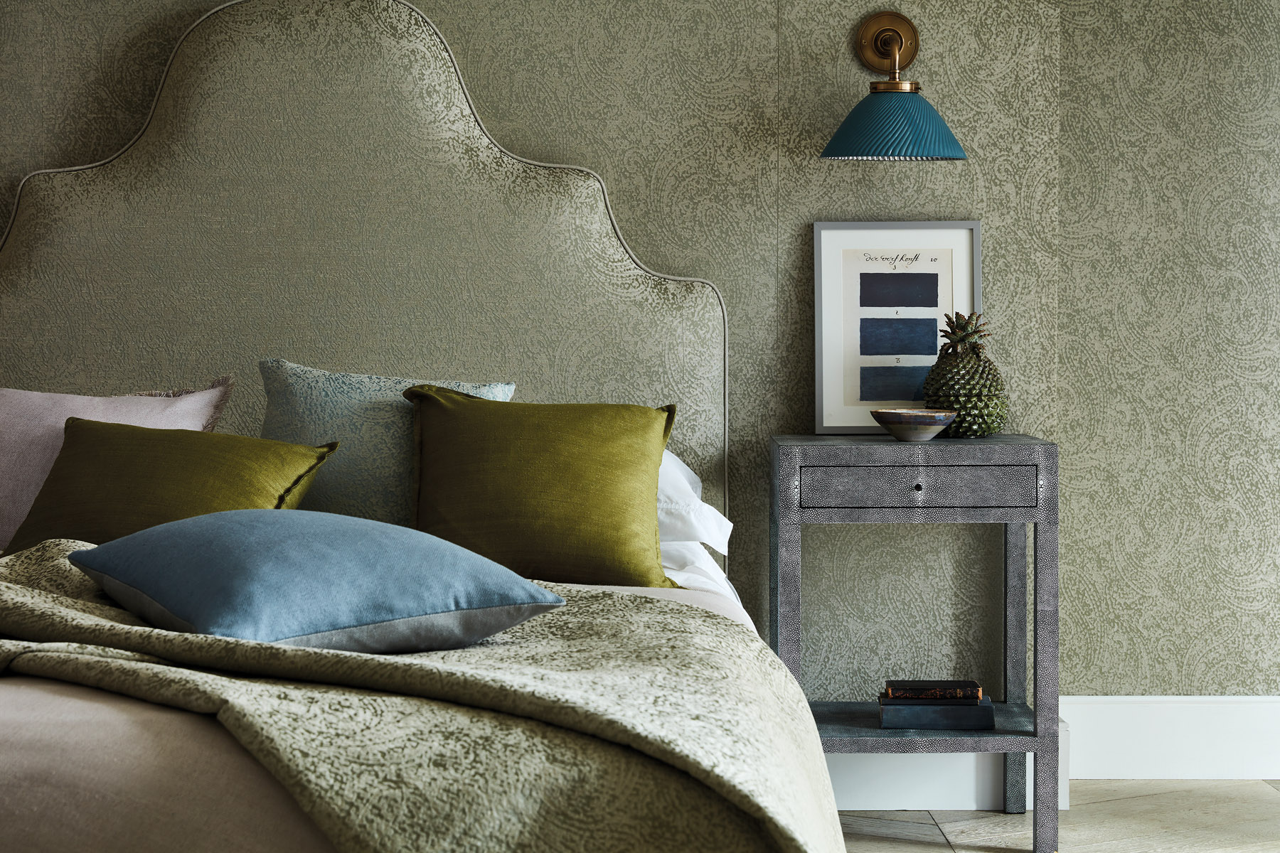
GREENS
Green is an extremely calm, positive colour as it stimulates thoughts of balance, growth and restoration in colour psychology. This colour immediately brings nature to mind; it's a refreshing way to bring the outdoors in.
There are various attractive shades of green ranging from emeralds and jade to forest green, olive and bright limes.
It makes an ideal wall colour in spaces where you need to open your mind, such as kitchens and home studies, and, as it's closely linked to money, it's a sensible choice for business properties. It can also be a beautiful, calm and tranquil colour depending on the green shade for the bedroom if the right shade of green is chosen.
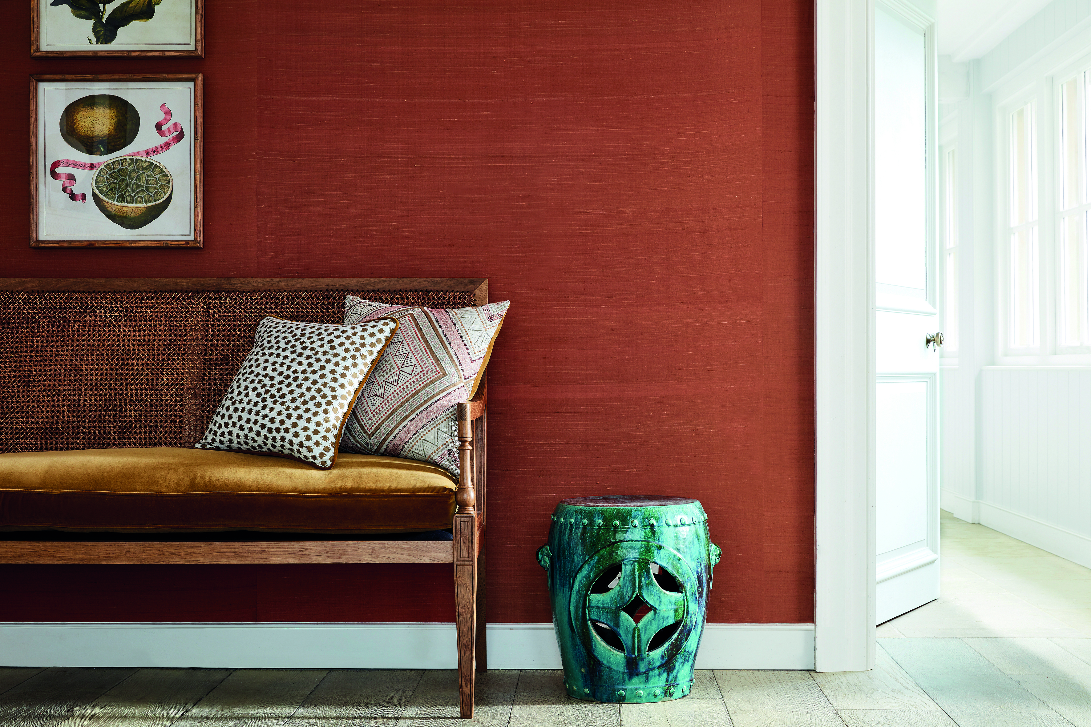
REDS
Red is one of the most dramatic and enticing colours for rousing emotions. It's often coupled with sentiments such as passion, excitement and energy.
Ambition, action and willpower are additional qualities attached to the primary colour, and that's why red can be a productive choice for home offices, creative spaces and kitchens.
This colour is powerful and passionate in its most basic form. It boasts many beautiful shades, such as crimson, salsa, burgundy and terracotta.
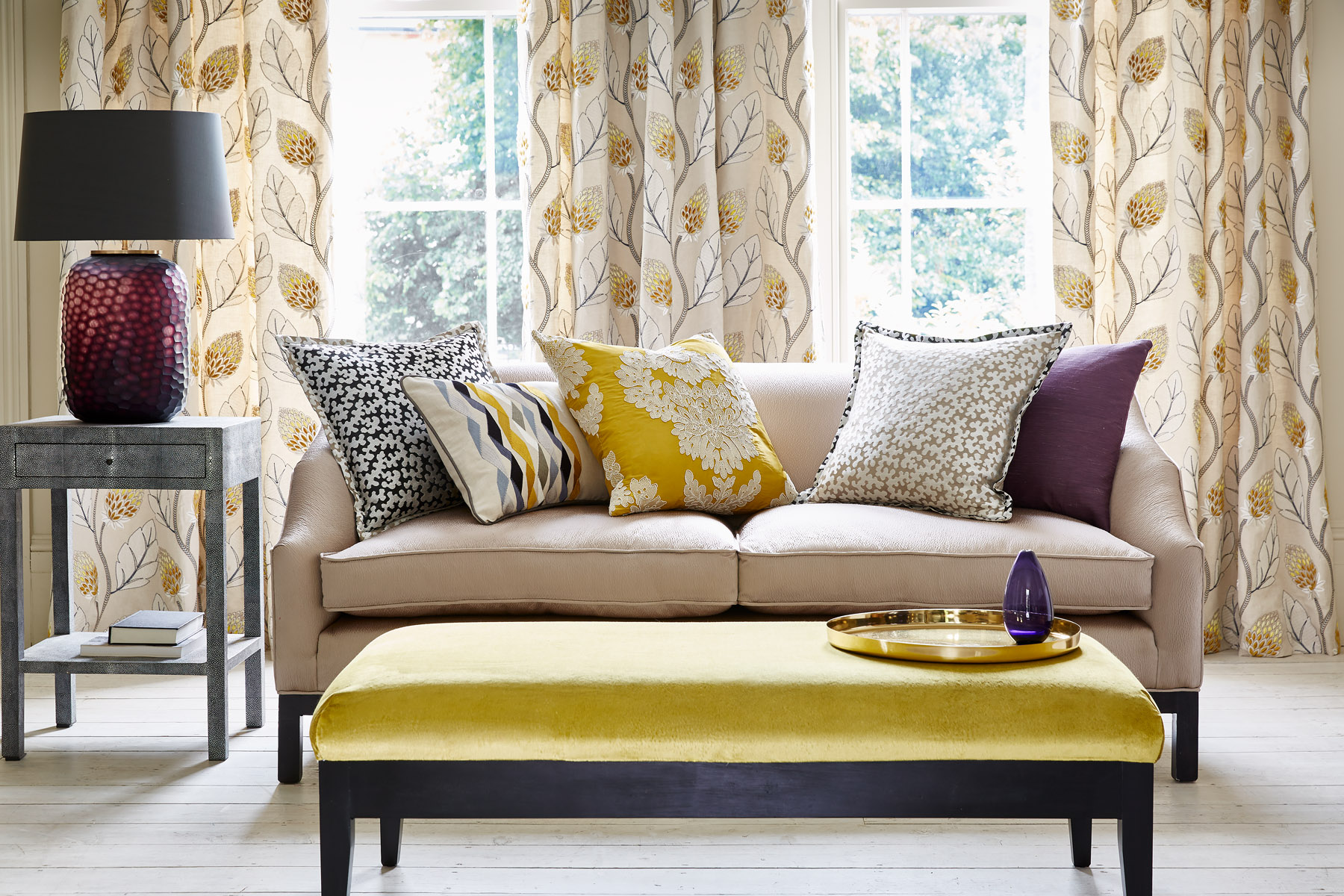
YELLOW
Yellow is connected with joy, optimism and energy in colour psychology. Whether it's mustard, lemon or buttermilk yellow, the different shades are unmistakably always vibrant.
We tend to use a playful yellow shade for children's bedrooms and nurseries. It can also be used throughout the house to give your home a beautiful bright, vibrant feel.
If too much yellow isn't your thing, but you would like a little of this colour throughout your home, you can always opt for a statement piece of yellow furniture or bold yellow accessories and soft furnishings that would make beautiful styling.
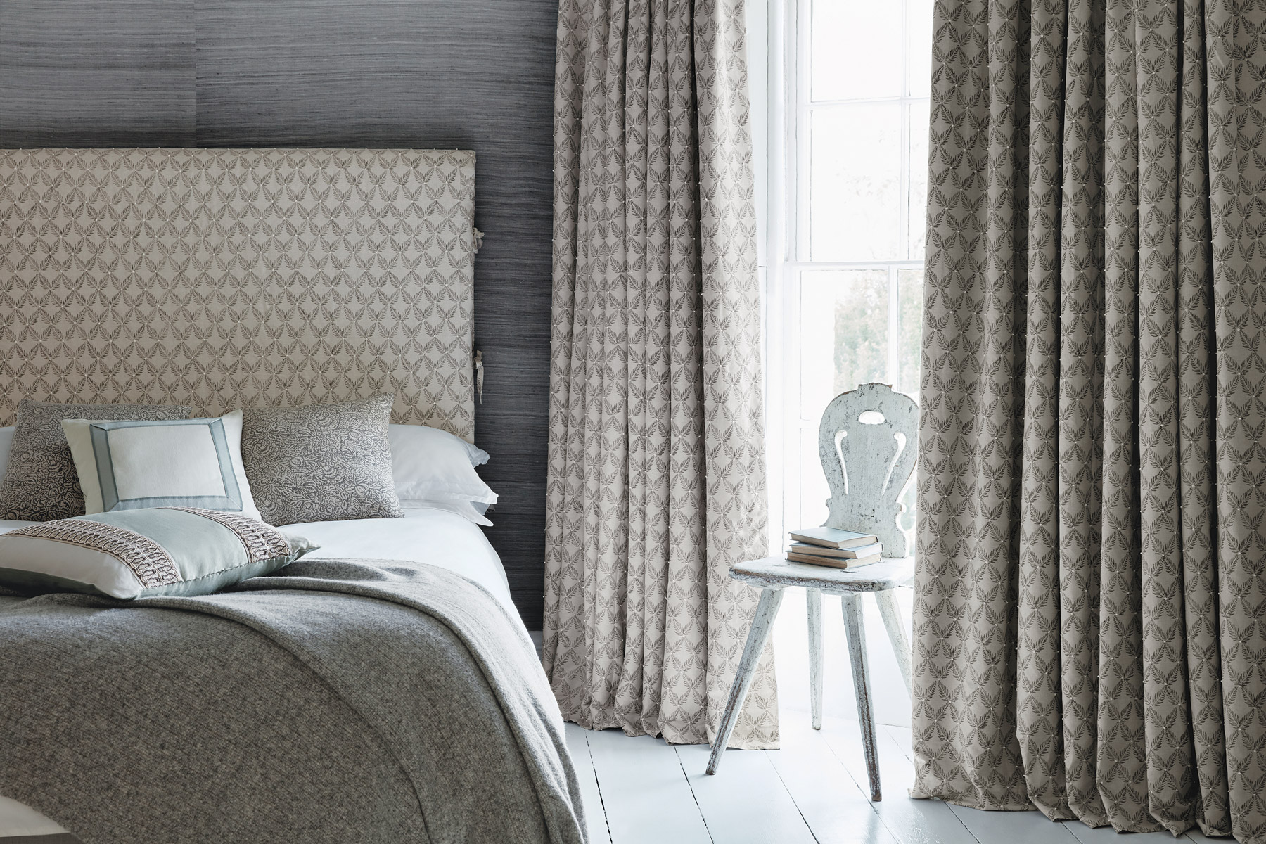
GREYS
Grey is one of those versatile colours that can take on a range of personalities. The shade in colour psychology is thought to influence perceptions of security, intelligence and solidity.
It is also said to be a calm and composure colour, ideal for family homes with super active little ones. You cannot get it wrong, as any grey shade is smart and goes well with practically any colour.
As with any colour, the results depend largely on how you make use of the shade. It can be soft and delicate or strong and confident where walls are awash with a matte block grey, which dominates the room and acts as a sharp contrast against a white ceiling and skirting board, whilst a velvet grey sofa can display a softer tone.
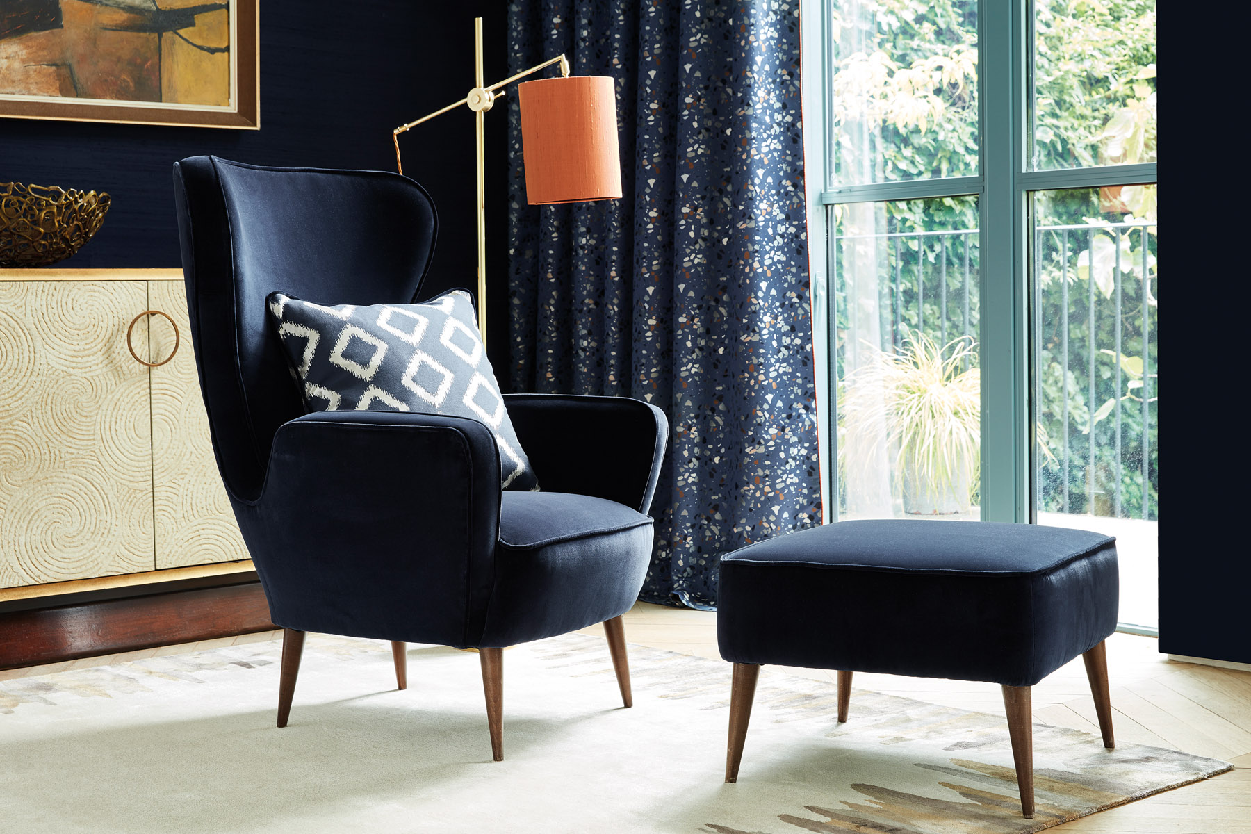
BLUE
Blues make people feel calm, it's also a cool colour, so it will bring your perceived temperature down.
Deep, bold hues such as navy and royal blue are great for evoking confidence and are associated with admirable qualities such as loyalty, trust, peace and success.
Lighter shades of the colour instill a calm and tranquil feeling at home, making them great for bedrooms and living spaces where you want to relax.
A is true with all colours, the more saturated the colour, the more the psychological effect.
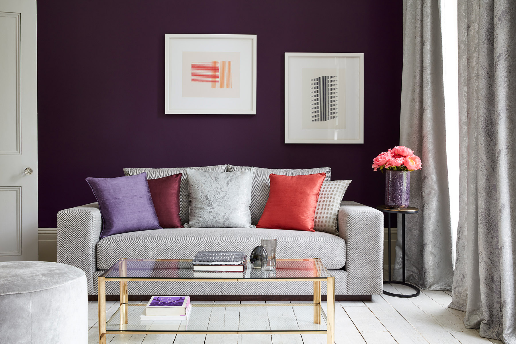
PURPLES
Purple is the colour of creativity; if someone wants to tap into their creativity, they should surround themselves with purple for inspiration. It's associated with a wealth of wonderful emotions from depth to fantasy and nobility in colour psychology. Purple is also worn by royalty, carrying a regal charm and suggests luxury, enabling the tone to bring real presence to the space.
It looks right as a pretty bedroom scheme, but deeper versions of the hue can also be incredibly masculine.


